3 March 2025- 17 March 2025 (Week 5-7)
Chika Clarissa Widjaja / 0378636
Design Principles GCD60804 / Bachelors Of Design (Creative Media) / Taylor's University
Task 3: Development & Design
TABLE OF CONTENTS
1. INSTRUCTIONS
2. PRACTICAL
3. FEEDBACK
INSTRUCTIONS
PRACTICAL
Sketch Chosen
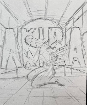
On task 2, we had to develop three sketches based on the artwork we chose. This sketch (Fig 2.1) was what my lecturer and I chose to further develop.
When creating this artwork, my main goal was to emphasize the character Akira and give a bit of storytelling about what the movie is about. I did this by using colors and elements that I incorporated into the artwork. I used Procreate for this piece, and since it was my first time using the software, this assignment gave me the chance to experiment and explore something new.
Digitalization
1. Building
In Fig 2.3, I covered the entire screen with the color red and downloaded a free building brush from the internet to help me lay out where I wanted the buildings to be. Then, I traced the entire building in black.
3. Ground
First Development Outcome
For the final touches (Fig 2.10), I added the Akira typography at the bottom instead of behind Akira, as I originally planned in the sketch, because the bottom part looked too empty. I also incorporated closure by adding Japanese typography from the movie. The design principles I used in this artwork are Emphasos, Contrast, and Closure.
 |
Second Development
After discussing and receiving feedback from my lecturer, I improved my first development by changing the Japanese typography to white, increasing the saturation of the mutated hands, making the glowing circle smaller, enhancing the contrast of the hatching lines, and bringing the tiny hatching lines closer together.
I changed the Japanese typography to enhance its readability. (Fig 2.11)
To make the road more contrasting, I added another layer and redid the road to make the lines darker. I also made the tiny lines closer together by slightly increasing the brush size. (Fig 2.14)
Second Development Outcome
After discussing with my lecturer in Week 7, we decided that the first development is better while keeping some elements from the second development, such as the size of the glowing circle, the red Japanese typography, and the contrast in the stripes. The image in Fig 2.16 is the final outcome.
Final Outcome
Rationale
1. Decisions I Made in the Design
For this artwork, I made several design choices to get the look I wanted. I went with black and red as my main colors because they’re a trademark of the movie and help create a sense of intensity, chaos, and dystopian tension. I positioned Akira in the center to make him the focal point and establish hierarchy. Originally, I considered using Adobe Illustrator, but I ended up choosing Procreate since it has more options that worked better for this piece. I also used a grunge brush to add texture and bring out the atmosphere and details. To help with the background, I used a building brush to map out the composition and placement of the buildings. Lastly, I put thought into the typography to make sure it reinforced the message behind the artwork.
2. Meaning/Purpose of the Design
The main purpose of this artwork is to provide a glimpse into the story of Akira. The central figure is kneeling while struggling to hold his mutating hands, just like in the movie. The background elements, colors, and lighting choices contribute to the overall message by creating tension and dynamism. My inspiration for this piece came from the movie itself, and I wanted to convey its essence through my visual choices.
3. Design Principles in My Design
I incorporated several design principles to create a visually compelling composition. Emphasis was used by placing the character in the middle, using colors other than red and black for the figure, the red glowing circle behind him, and the lines that guides the viewer's eyes to the central figure. I used hierarchy to make sure the main focus is clear and draws attention. I placed Akira in the center because I wanted him to be the focal point, making him the first thing people notice. His size also helps establish importance, especially if he’s larger than the other elements. I applied contrast through color to convey the atmosphere in the movie. Finally, I incorporate closure in the Akira's typography. Even though the whole text isnt seen because of the Japanese text, our brain can still read it.
FEEBDACK
Week 6:
- Make the mutated hand more saturated, Maybe like a meat color.
- Make the glowing circle smaller.
Week 7:
- The red mutation hand is camouflaging with the floor
- The first development is better. However, keep the contrast in the road, the skin of the mutation from the first development, the red Japanese typography, and the smaller size of the glowing circle.


Comments
Post a Comment