23 September 2024-21 October 2024 / Week 1-Week 5
Chika Clarissa Widjaja / 0378636
Typography / Bachelors Of Design (Creative Media) / Taylor's University
Task (Exercises/Projects)
TABLE OF CONTENTS
LECTURES
WEEK 1/ INTRODUCTION & BRIEFING:
Lecture 0: Introduction
- Typography. Helps develop attention to detail, crucial in all areas of
design.
- Learning. Goes beyond the classroom and requires independent
exploration.
- Digital tools.
Make typography more accessible but emphasize the need for skilled
designers who understand its history.
- Font.
A specific style within a typeface, like Georgia Bold or Georgia
Italic.
Figure 1.1 Fonts example
(23/09/24)
- Typeface.
A family of fonts, such as Georgia or Arial.
Figure 1.2 Typefaces (23/09/24)
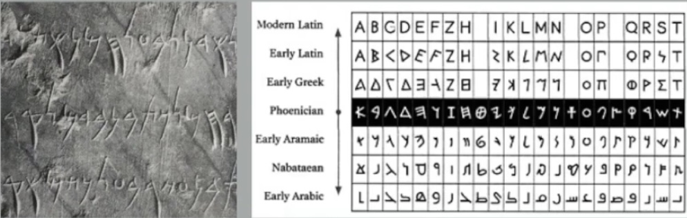
Lecture 1: Development
- Typography evolution. Understanding its history helps designers
avoid repeating past work.
Figure 1.3 Typography's
history (23/09/24)
Figure 1.4 (23/09/24)
Figure 1.5 (23/09/24)
- Inclusivity. Incorporating non-Western typography enriches design
history and practices.
- Technology. Early writing tools shaped letterforms, emphasizing
technology's role in design evolution.
- Uppercase to lowercase. The shift reflects the importance of
practicality and readability in design.
- Gutenberg. The printing press revolutionized text production,
advancing literacy and education.
- Type classification.
Knowing serif and sans-serif types improves style choices for readability
and aesthetics.
- Local research. Students should research local design stories to contribute to global
design and correct historical biases.
WEEK 2:
Lecture 3: Text P1
- Kerning changes letter spacing, especially in headlines and brief
sentences, for readability and aesthetic harmony.
- In order to improve readability, proper letter spacing is important,
especially for uppercase text. Lowercase letters should have closer spacing in
order to maintain a good flow.
- In design, readability is important and is affected by line length, leading,
and type size. A general rule is to keep the line strength between 55-65.
Figure 1.6 (3/10/24)
- Perception is also affected by font alignment. Text that is flush left
is easier to read, but text that is centred or aligned right gives visual
appeal but may make reading more difficult.
- Designers must choose typefaces that are appropriate for the text's
purpose since font choice reflects meaning and emotion.
- Test typefaces in print according to their final format at all times.
The accuracy of readability depends on using actual printed tests, because
what might seem good on screen may not seem well to print.
WEEK 3:
Lecture 4: Text P2
- Pilcrow: Symbol that is available in most type face, used set set in
text to indicate paragraph spacing
- Cross alignment: When you have two columns of text sitting next to
each other where the text is align to the next column as well.
Figure 1.7 Cross Alignment (11/10/24)
By ensuring the leading and paragraph spacing have equal value, cross
alignment will be ensured which makes a good typography.
Difference between spacing and leading
- Leading space: the space that you see between two sentences.
- Line spacing: the baseline of one sentence to the descender of the
sentence.
Indicating paragraphs
To save space and cramp as much information within a small column of
text field in a newspaper, journalist used to take away the paragraph spacing
and use indentation.
Figure 1.8 (11/10/24)
Whenever you use indentation the best alignment is when the text is
justified.
- Widow: a short line of type text left alone at the end of a column of
text.
- Orphan: a short line of type left alone at the start of a new column.
Figure 1.9 Widow and Orphans (11/10/24)
Highlighting text:
- Italics
- Increase boldness or weight
- Printing colors of the text (only black, cyan, magenta)
Figure 1.10 (11/10/24)
- Primes: indicate ft and inches.
- A head: A clear break between a section. A heads are set larger than
the text in small caps and in bold.
- B head: A surbordinate to the a heads.
- C head: Although not common, highlights specific facets of material
within the b head.
Figure 1.11 (11/10/24)
WEEK 4:
Lecture 5: Basic
- Baseline: Imaginary line and visual base of the letterform.
- Median: The imaginary line defining the X-height of the
letterform
- X-height: Height in any typeface of the lowercase 'x'
Figure 1.13 (17/10/24)
Figure 1.14 (17/10/24)
To work successfully with type:
- Work with full font, and how to use it
-
Choose a type family that has man different typefaces so you have a
variety of choices.
Work with full fonts containing:
- Lowercase
- Small capitals
- Italic
- Uppercase and lowercase numerals
- Punctuation, miscellaneous, characters
- Ornaments
Describing typefaces
Figure 1.15 (17/10/24)
Figure 1.16 (17/10/24)
INSTRUCTIONS
<iframe
src="https://drive.google.com/file/d/1rxoK_XgwaHhK0s5uO3JyYb_ttnf9d3Y1/preview"
width="640" height="480" allow="autoplay"></iframe>
Task 1: Type Expression
RESEARCH (reference pictures)
chopped reference

explode reference
pull reference
Wind reference
For this first task, Mr.Vinod asked us to brainstorm ideas for developing a
font that reflects its meaning. I explored different concepts and played
around with their opacity, size, spacing, and composition to create these
sketches. Here's what i came up with.
Figure 2.1 Sketch of my type expression.
(27/09/24)
Task 1: Exercise- Formatting text
(the ones highlighted are the sketches that got selected)
Explode=
1. For the first design, i made the letter o explode while the other
letters are impacted and the pieces of the letters are scattered
around.
2. For the second design, my point was to symbolize a ticking bomb to blow
up the letters. It starts off with a small, faded letter, and working its
way up as big, bold capital letters that blows up.
Pull=
1. For the first design, the word is being pulled kind of like out of their
'comfort zone'. It starts off being small and faded, then pulled outwards
and being more and more visible.
2. For the second design, parts of the letter is missing because it's being
pulled.
3. For the third design, the letters are being pulled in perspective
4.For the final design, the letters are being pulled to stand straight
because it was laying down in the ground. However, i decided to make some
changes because Mr. Vinod said it's not really giving pull. So here's the
revised sketch:
Figure 2.2 Pull revised
This time, a rope is pulling down the letter P to accentuate the word 'pull'.
Wind=
1. For the first design, with bold capital letters, the word wind is being
blown upwards.
2. For the second design, the letters are moving in a direction how a wind
would move.
3.
For the final design, the letter starts of standing, then it's blown as if
someone is blowing on it.
Chop=
1. For the first design, I wanted to personify the letters being chopped
like a hair. So it's being cut as it drops to a ground like how a hair
would.
2.For the second design, it's a pretty straightforward action. The word is
sliced in the middle as it slants a bit as if it's on the way to fall.
3. For the final design, I wanted to suggest the word being cut like food
in a cutting board. This explains why the letters fall as it's being
cut.
Digitalization
Figure 2.3 Explode Progression (11/10/24)
The picture above shows my progress after receiving feedback from Mr.Vinod.
The feedback he gave was to make the text more angled and closer together to
create impact.
Figure 2.4 Wind experiment (11/10/24)
The picture above shows my exploration with the word wind with different
placement, distance, and composition.
Figure 2.5 Pull progress (11/10/24)
The picture above shows my progress after receiving feedback from Mr.Vinod.
The first pull isn't showing pull, the second pull isn't allowed to use
illustrations, and the third pull is part of the letter P is being pulled
apart in a downward angle.
Figure 2.6 Chop unrevised (11/10/24)
Figure 2.7 Chop revised (11/10/24)
A revised version of the word "Chop" after receiving feedback to enlarge the
text.
Final Type Expression
Figure 2.8 Final Type Expression (11/10/24)
Final Type Expression PDF
Animation
Figure 2.9 Animation frames (11/10/24)
After watching the tutorial that Mr.Vinod gave us, i began making the
animation frames in Adobe Illustrator, with a total of 9 frames.
Figure 2.10 Animation frames (11/10/24)
Next, i began to animate the word chop in photoshop then exported it as a gif.
Final Animation Type Expression
Figure 2.11 Final Animation (11/10/24)
Task 1: Exercise 2- Letter Formatting
Lecture 1/4: Kerning & Tracking
Figure 2.12 Letters with Kerning (20/10/24)
Lecture 2/4: Text Formatting
A line of text should contain around 55-65 characters, the font size should
range from 8-12 points, and the leading should be 2-3 points larger than the
font size.
Figure 2.13 Text Formatting (20/10/24)
Lecture 3/4: Type Formatting
In this video, i learned about connecting text fields, alignment, how to fix
ragging by pressing the option key+arrow, and inserting an image and making it
fill the frame.
Figure 2.14 Type Formatting (20/10/24)
Lecture 4/4: Text Formatting
Cross alignment and Baseline Grid
I followed the tutorial video to create a layout from Mr.Vinod and did not
change anything except for the image.
Figure 2.15 (21/10/24)
Next, I moved the headline and byline to the left to make it look more
organized.
Figure 2.16 (21/10/24)
Finally, i changed the font of the headline and moved the second paragraph
above to give the white space a room to breathe.
Figure 2.17 (21/10/24)
After receiving feedback from Mr.Vinod in class, i changed the size of the
headline and byline as he said it's too small. I also give more spacing
between the headline and byline as suggested.
Figure 2.18 Final layout (21/10/24)
Final Layout PDF
HEAD LINE
Typeface: Bodoni 72
Font/s: Bodoni 72 Book
Leading: 21 pt
Paragraph spacing: 0
BODY
Typeface: Univers LT Std
Font/s: Univers LT Std 57 Condensed
Type Size/s: 9 pt
Leading:
11 pt
Paragraph spacing: 11 pt
Characters per-line: 58
Alignment:
left justified
Margins: 12.7 mm top, 26 mm left + right + 50mm bottom
Columns:
4
Gutter: 5 mm
FEEDBACK
Week 2:
General feedback:
Sketch has to be legible to the eye, consider what font you're gonna
use for each sketch, consider the weights of the font, pull the word in
one direction instead of multiple, do not overly distort, just minor
changes.
Specific feedback: Mr.Vinod told me to make some changes on the word"pull'. It doesn't
really look as if the word is being pulled. Instead of making the whole
word distorted, he suggested to distort the letter U only. For the word
wind, the last two isn't read-able. Other than that, it was fine.
Week 3:
General Feedback: Do not screen grab, export it as
jpg.
Specific Feedback: Chop needs to be bigger, explode has too much
space and too straight, Wind is too linear, Pull can't use the rope
illustration.
Week 4:
General Feedback: Don't stretch your font. To know if your font
is stretched: Cmd T. This window will give you the font size, leading,
how much kerning or letter spacing. Press the small and down arrow and
press more information. If it's less than 100% then it's stretched.
Write down the typeface you're using.
Specific Feedback: It looks ok, straightforward
Week 5:
General Feedback: You can't have a large amount of text type set
involved. Maximum four line of text at the most. Image choosen has to be
black and white, has to be related to helvitica, and not too much text
because it will clash with the headline. Whenever starting a text, there
is a hangline and it has to be mantained throughout the pages. Gutter
can't be too big. Manage your time. Don't worry about your grades,
focus on your work, and how well you want to do for yourself.
Specific Feedback: A good amount of space and balancing it out.
Good that it starts from the left to the right to the end. In all aspects,
it's a good layout and has a good spacial arrangement. Good that it gives
the white are the room to breathe and that the reader would want to read
it. However, the byline's typeface is too small, byline should have more
space to the headline, and the headline is too big.
REFLECTIONS
Experience
Overall, my experience at first was both quite overwhelming and confusing. There
were a lot of instructions, new concepts, and adjustments to make,
especially creating this e-portfolio. However, as time goes by and through the tasks that were given, i
gained new knowledge i didn't know before about typography. I learned so many new things in just five weeks that i can't mention all. It was hard but enjoyable. I start to notice things differently too after learning typography. For example, i start to notice typefaces around me in stores, restaurants, packagings, etc. I thought about what font is that? Or how the font matches the brand so much. Small things like that were noticed after i learn a bit about typography. I say this because even though i feel that i learn so much, I know that this is just a sneak peak to typography and there is more to learn in the future which i'm quite excited to discover.
Observations
From what i observed, it is important to not trust too much of the
digitalized version of your artwork. When printing it out, the color may
look dull or different than the ones in our laptop. I noticed this in week 4
when we were told to print our text layout. I also observed how important it is to manage our time and to read the instructions before handing your assignment. Reading the instructions may seem simple but if you don't look close enough there might be things that you miss.
Findings
Through further reading, i learned more about the anatomy of typography such
as weight, x-height, tracking, and more. During feedback session, Mr.Vinod
provided a lot of useful and constructive feedback that helped improved my
work. For example, he emphasized that if you choose the right typeface,
font, & weight, you're on the right track, and that simplicity is more
important than overusing effects. I also learned more about Mr.Vinod's
preferences, such as sketches well-organized sketches, effort that we put in
the sketches, numbering the sketches, and incorporating jump links to make
his job easier.
FURTHER READING
Week 1 (23/09/24) :
Figure The Fundamentals Of Photography by Gavin Ambrose & Paul
Harris
I wanted to learn further about typography outside of class. I read
about 8 pages of the book and here's what i learned in my own words and
understanding:
-
Serif: It's called serif because they have decorative lines
hanging around them called serif. Usually bank, jewellery, lawyers,
use this font. Avoid using this font when trying to be fun/playful.
-
Sans-serif: "Sans" means "Without" in french, so it
basically means "without serif"
- X-Height: The capline of the lower case letters.
- Leading: The space between lines of text.
- Tracking: The space between the entire word.
- Kerning: Space between two letters.
-
Accessible contrast: Color difference between the
typography and background.
Week 2 (30/09/24):
Typographic Design: Form and Communication By Rob Carter, Ben Day,
Philip Meggs
Formal reduction can be used to create clarity and legibility,
giving complicated information such as news or scientific data, but in a
clear and straightforward way.
Presentation that has a good order guides the eye from one
element to another, keeping reader's interest and attention.
Another approach is expressionism, its purpose is
through formal elaboration and ornamentation, making visual
impact. When appropriate, attention can be given to experimental,
expressive and ornamental possibilities.
Ornament serves a variety of practical needs because it is
semiotic, iconographic, and historical, It identifies the object with
which its associated. Expressive and ornamental possibilities.
Week 3: (7/10/24)
Figure 5.3 (07/10/24)
On Web Typography by Jason Santa Maria
Why Typography matters:
Typography is one of the greatest design assets. Good typography gives
spirit to words. It doesn't matter how well considered your layout is
or how well wonderful your website interactions, imagery or writing
are. If your type is bad, then the design fails.
- Typography is communication.
Through type, we're able to communicate our message and play with
the tone of the delivery. Just as different musicians perform the
same song differently, we can take a variety of approaches to the
way we deliver a message.
Tabular figures keep your number lined up nicely in vertical
columns, making data in things like tables and spreadsheets easier
to scan.
Punctuation
Make sure your font contains the basic forms you'll need for
sentences (period, question mark, etc.)
Set of dashes ( hypen, en dash, and em dash)
Proper quotation marks (not straight quotes)
Week 4: (14/10/24)
Proper quotation marks are often overlooked, but it's important to know
the difference.
Curly quotes: Usually called smart quotes, commonly look like
filled in 6s and 9s.
Correct punctuation for quoted text and dialogue.
Straight Quotes: Often called dumb quotes, are usually straight
and vertical.
Dumb quotes are called as such because not only they are incorrect, but
also an instant sign of bad typography.
Use of improper quotation marks shows a designer who hasn't learned the
right way to signify quoted text, or didn't spend enough time looking
for a font with full punctuation support.
Week 5: (21/10/24)
Choosing type for extended reading
When searching for good options for long form text, we need to recognize
that we're asking someone to live with this typeface for an extended
period of time. Every eccentricity is amplified when used page after
page.
Sufficient X height.
The lowercase letter should be tall enough to not feel dwarfed by the
uppercase letters and create a nice balance at the page level.
If the texture of the text looks like it favors the capitals too much,
the x-height may be too small.


.jpg)
.jpg)


Comments
Post a Comment